Established by the Australian Print Workshop (APW), the Australian Print Workshop Artist Fellowship program is the most significant of its kind in Australia and was awarded annually between 2017 and 2021. The Fellowship enabled a number of leading Australian artists to research, develop and create a new body of work in the print medium.
Shaun Gladwell was awarded the fellowship in 2019.
~
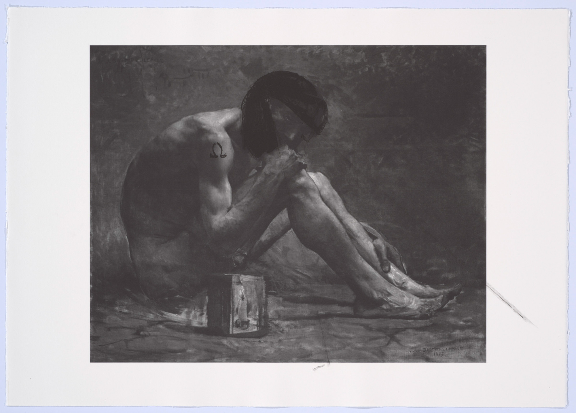
In a recent video interview you mentioned that the 2019 fellowship was the third time you worked at the Australian Print Workshop (APW). What was the first body of work you made there? Was the print Allegorical Study/Riding with Death, 2007 part of it?
In the moment, I forgot how many times and just said three. Three formal invitations perhaps? I’m often on the APW doorstep with singular print projects in mind.
If we are beginning at the very start, then I think I approached early etchings and lithography primarily from a drawing practice and focused on monochromatic processes to focus. More recent projects experiment with multi-plate and colour processes as well as collage and montage, however drawing remains foundational throughout.
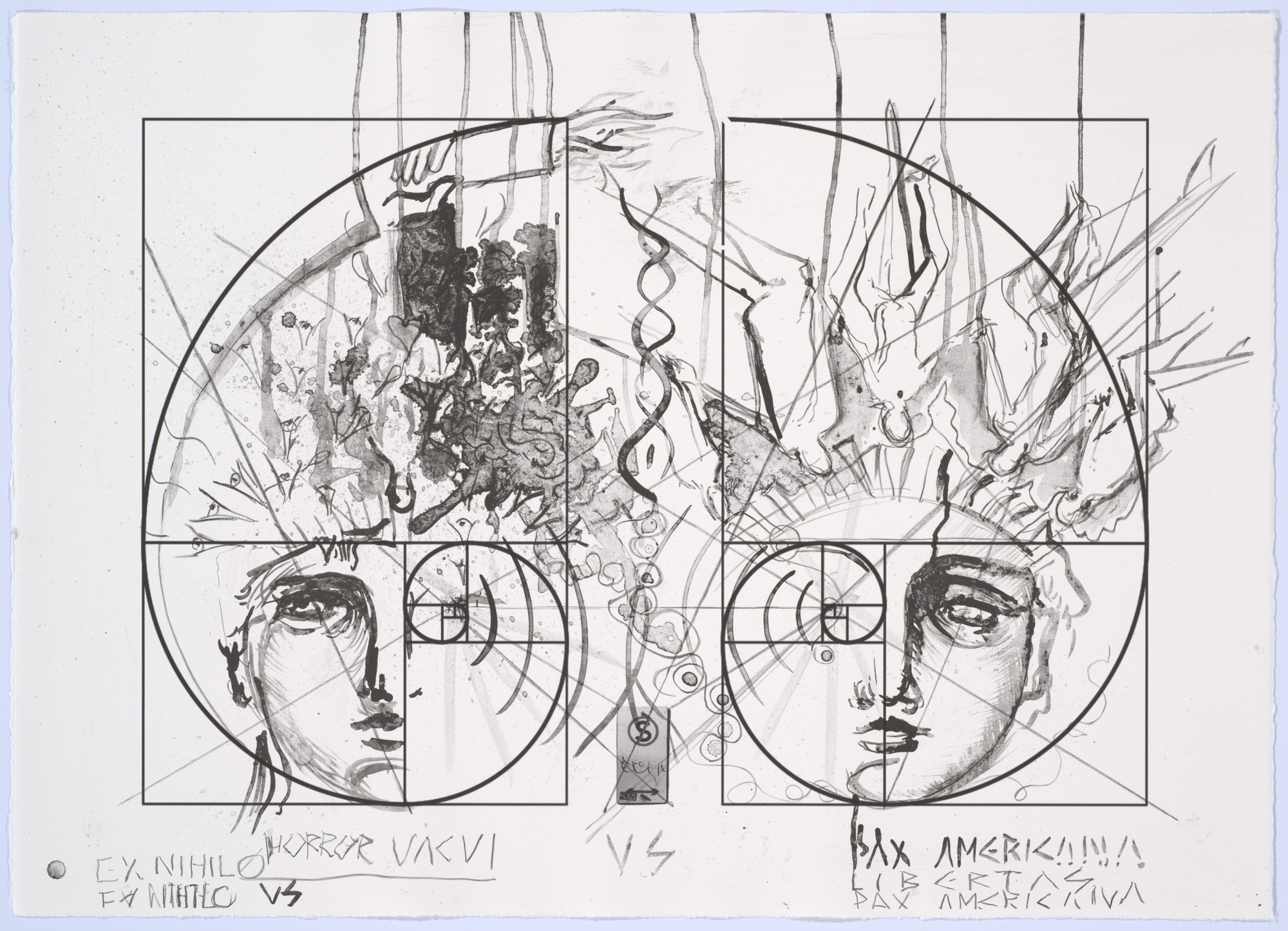
Riding with Death was made at the very beginning of my relationship with the APW. The key image reference was Leonardo da Vinci’s allegorical study of a human riding the skeleton of a horse, itself skeletal — an image heavily reinterpreted over time. I initially related to the image and concept of riding as a physical act and experience. I’m a keen but infrequent rider of horses, motorcycles, bicycles, skateboards, snowboards, surfboards, etc. Riding as a sport or recreation or dance is in proportion to its risk, of falling. The ride inherently signal’s the danger to those riding or for all if the ride is symbolic of life. The original da Vinci composition offered elements of Vanitas and Memento Mori to explore further.
Early print projects engaged art historical references and the ‘institution of printmaking’, its own history, traditions and conventions. Letting lithographic tusche wash outside the paper and plate frames was also to acknowledge the power of these very same framing conventions. Titling, formatting, and sequencing through frontispiece and colophon/index were also important para-textual features of these early projects.
With any mention of European artists I need to clearly state the importance of Australian printmakers and their influence upon me. At the time of processing these lithographic and etching plates, I was researching the work of Laurel Nannup, a senior and respected Noongar artist. Laurel is well known for her public sculpture First Contact (2016), the singular most important public sculpture in Australia, and far beyond, in my humble opinion. Laurel is also an incredible printmaker (traveling to and producing very powerful yet delicate scenes of New York City).
In 2014 you were awarded the APW Collie Print Trust Printmaking Fellowship, and you worked there at the same time as choreographing the dance piece Dead Flag Blues for the 2014 Keir Choreographic Award at Dancehouse, Melbourne; how did these two projects influence each other?
How does the physical process of working at APW and collaborating with the printers connect to your experiences of performing and choreographing?
Like so many other collaborative processes, I do think printmaking itself can be read as a coordinated locomotion of bodies, materials, hardware, and chemistry. If this process is viewed either as alchemical and ineffable or coordinated creative labour and materials, there is a collaborative choreography taking place that makes printmaking — or my experience of it at least — entirely commensurable to other formal or non-institutional movement languages.
Conceptual relationships and coordinates well beyond the optical image and frame never override the tactile, physical properties of printmaking for me. The fetishism and objectophillia within traditional materials and processes are themselves a self-reflexive subject matter. The printed image is a complex of reactions, pressures, and layers almost geological in formation. I am also imagining subcutaneous ink maps within in the paper flesh/fibre. Within these differing coordinates, the printing process is shaped as a retinal and conceptual but also equally physical, locatable, and relational. I consider Brett Whitley’s “My relationship between screen-printing and Regent’s Park Zoo” from 1965 to be a good example of this free-play of elements and materials (whilst also offering the title as a an open question, mandate or charter for itself).
At the time of printing, cross country and trail running informed my creative practice. Mostly running known tracks, re-establishing old ones whilst getting lost, cold, hungry, and frustrated trying to find or create new tracks.
In 2014, I was working with colleagues based in performance and choreography on a group devised presentation. We explored militaristic control and the calibration of bodies throughout contemporary conflict, resulting in the performance Dead Flag Blues. Pre-recorded and live music was a key element in development and performance. I also worked with similar music throughout and found the death and speed metal sub-genres of heavy metal music to be the most interesting. The print edition Seasons in the Abyss (2014) appropriates the title from the fifth studio album by American metal band Slayer. Apart from wishing to analyse the construct of heavy metal an approximation in sonic violence to warfare, I also wanted to consider the poetic force of the album title detached from its music, whilst also acknowledging the horror-reality of sonic based weaponry. Sound could now have lethal effect on live targets. This aural, sonic aggression was then compressed into figurative representations through a regard for techniques specific to lithography. A velocity within drawing was needed but the scaling and removal from the force of the subject matter is now, of course, an enormous compromise. Quickly the concerns become that of lithography as a process, oscillating between figurative control and the medium’s ability to describe its own physics. Less descriptive forms and semi-controllable effects were explored after initial figurative drawing. Topographical view of boiling surfaces — scorched earth and skin — dis/appeared in techniques such as the watery peau de crapaud. This was largely an attempt to ride with, rather than fully control. Open gravitational pooling and dripping also seemed indexical to sonic, spatial distortion and feedback but this signification, or claim, again, can never approach the subject, which will remain unrepresentable.
I was also very interested in drawing’s from Käthe Kollwitz instilling horror and despair, mourning and tenderness in the same composition. Also, Barbara Hepworth’s Hospital Drawings as exemplars of harmonious and complex compositions of delicate human surgical collaborations. I was taking these art historical examples into dance as well as printing. Bodies and images were asked to reflect on the great forces exerted upon and exuded from individuals, however subtle or gross, within the emergency of geo-political conflict. A critique of control and violence through printmaking and dancing happened simultaneously and this was a personally unknown yet historically loaded pas de deux.
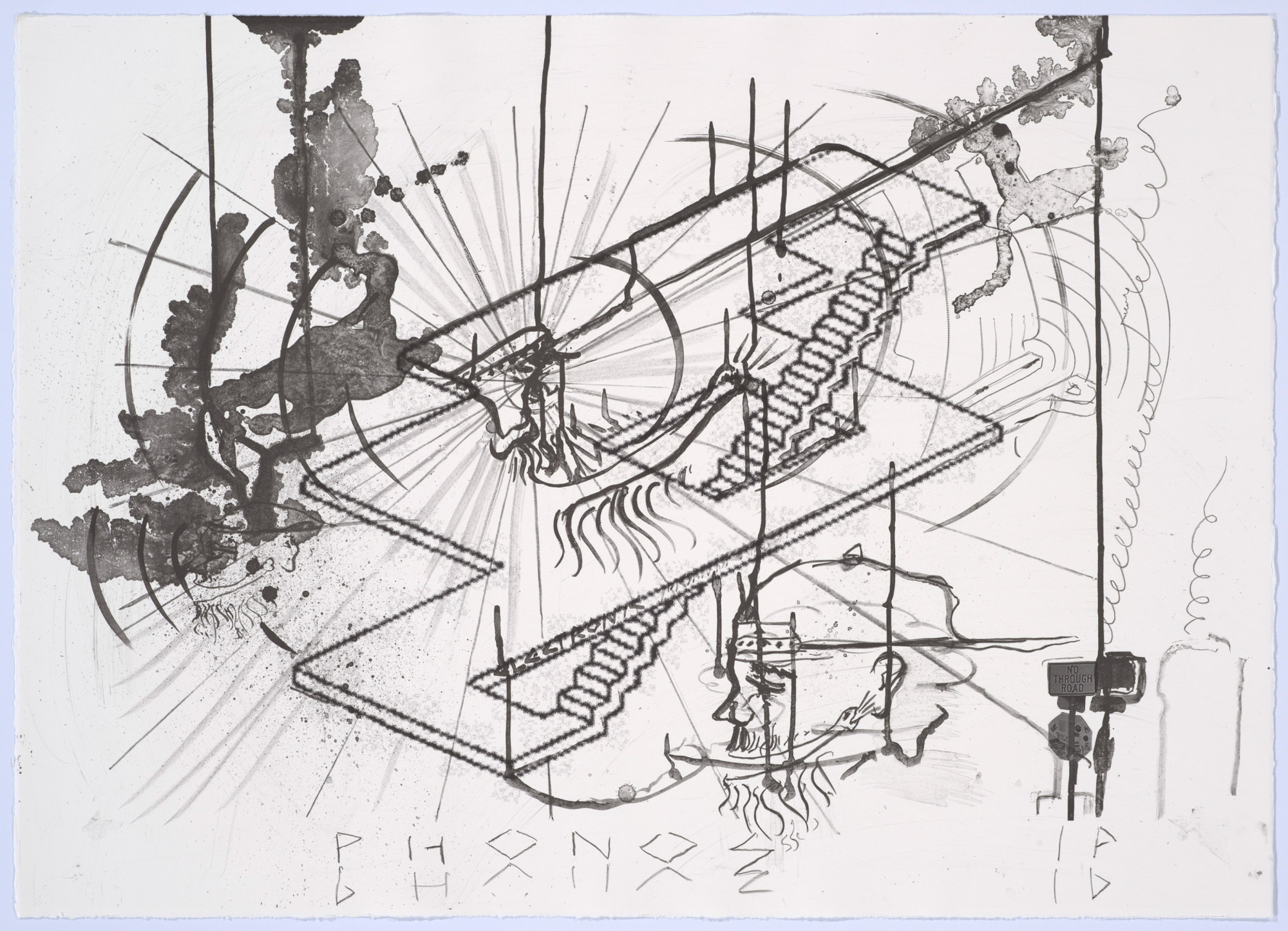
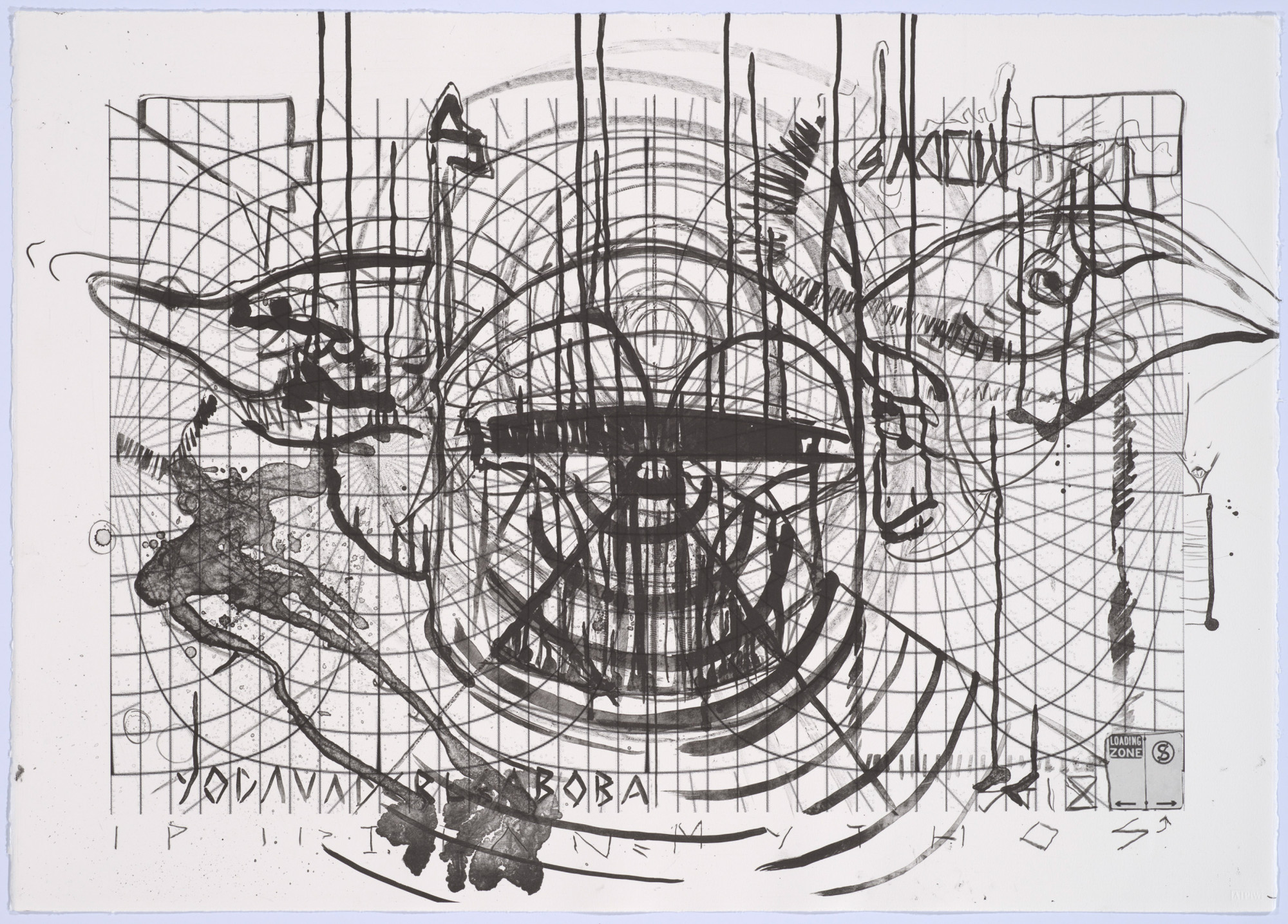
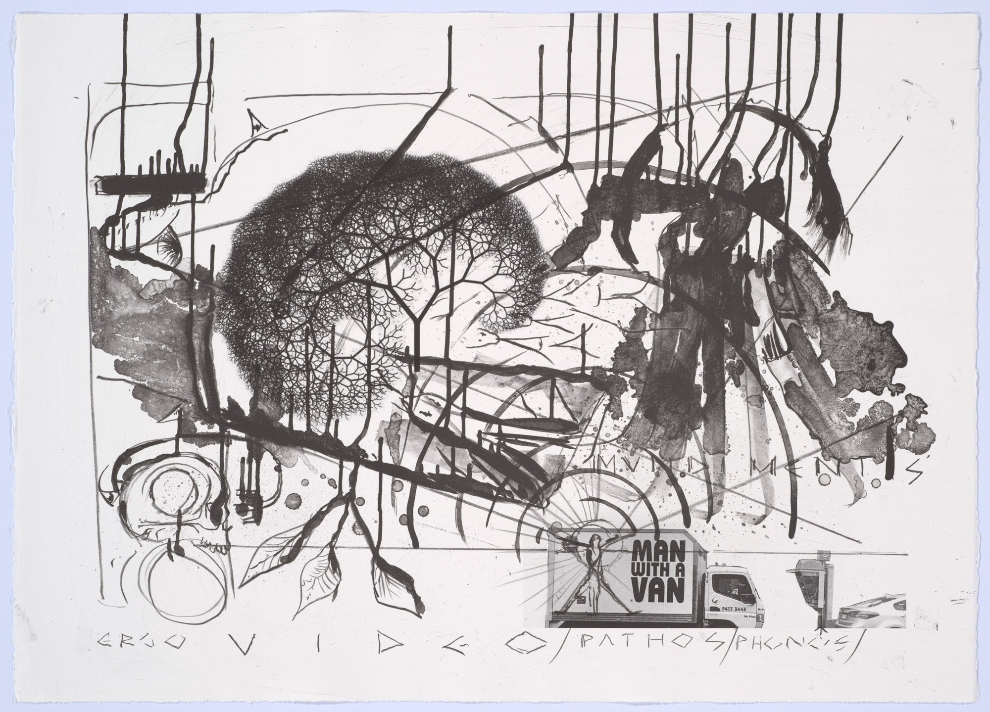
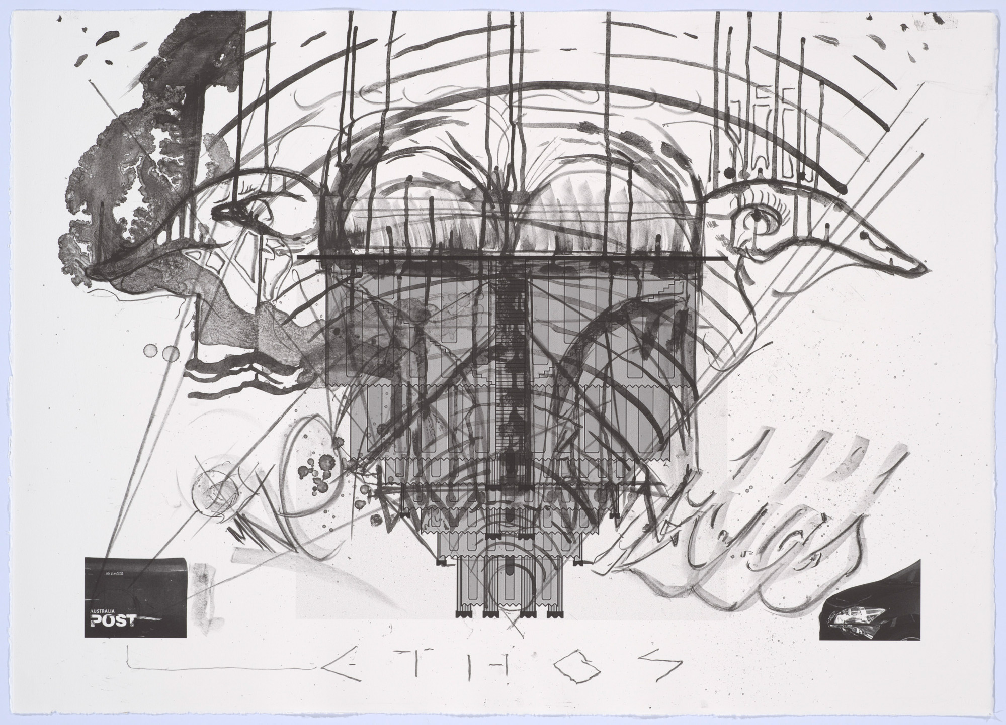
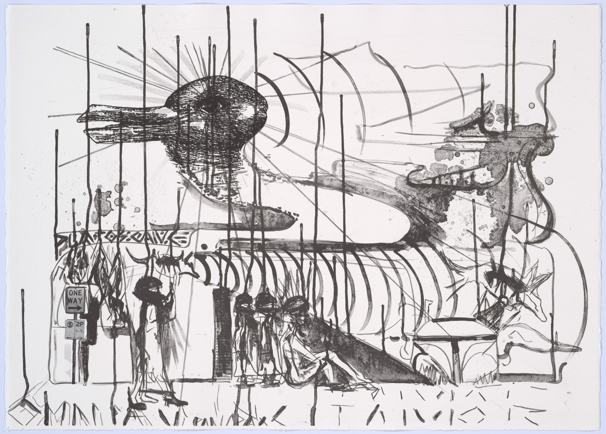
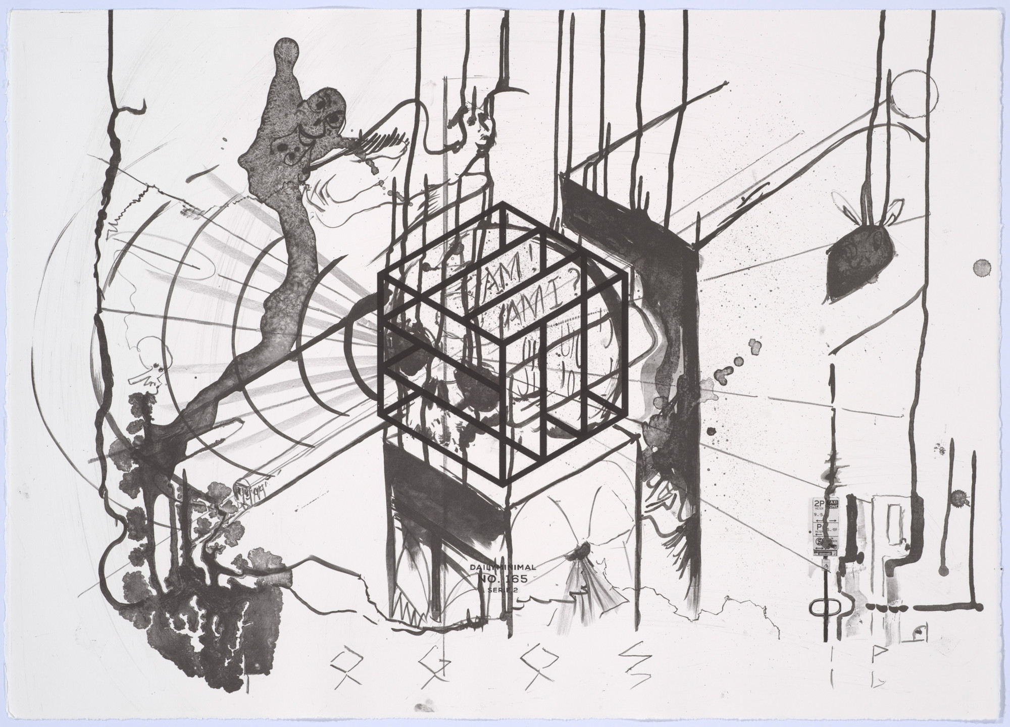
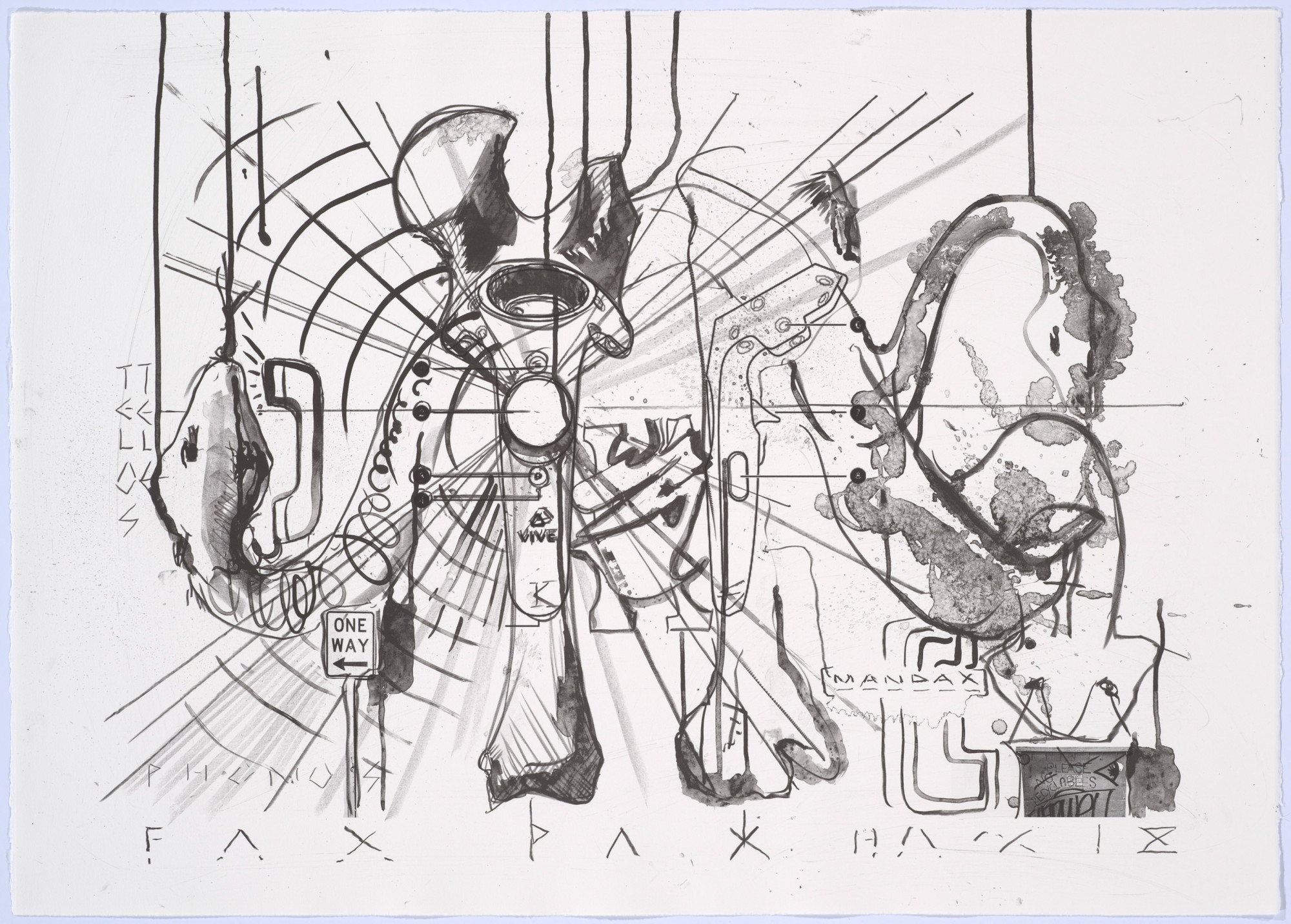
Your most recent prints at APW were created in 2019 as part of their Artist Fellowship program. It gave you a chance to create a set of photolithographs with drawn elements, what drew you to explore this printing process.
The sequencing of these works was important within the recent fellowship work-period. Photolithographs were produced first and began as location studies, namely, the streets immediately surrounding the APW. It was important to begin with an investigation of the local as the immediate physical and aesthetic locus.
Graphic elements of these prints were overtly sourced from the neighbourhood. Street signs, postal boxes, street art and vehicles were firstly photographed then printed and drawn upon. Photographic elements were localised and identifiable through graffiti/street art whilst other elements were introduced from vastly different sources. A Fitzroy parking sign was absurdly juxtaposed with an inverted diagram of the Neo-Sumerian Ziggurat of Ur. Drawing became a way of navigating through and within a composition of various image time-spaces. There was an immediacy and speed to these drawings but only after extensive preparatory studies, all on ubiquitous A4 office paper, which for me is also the DIY independent zine aesthetic. I also hold a great respect for the importance of the photocopier as an immensely important printmaking tool.
Stencilling, wheat pasting, lithography, photocopying, etc, have constituted the aesthetic of the modern street and shaped its politics. Mass political, commercial, and artistic message craft was first possible in print and the street is its traditional stage. It was important for me to reflect upon this history during the processing of these first plates.
In the lithographs you play with language and juxtapose Greek and Latin references with photographs from the urban environment, like of street signs. Some of these elements seem quite tongue in cheek. I’m curious how you feel about the role of humour in your practice?
I was imagining a kind of territorial graffiti crew related dispute between two competing systems, which was the case for Greek and Latin at one point in history, and for this conflict to play out a few millennia out of time. Some images and signage were just asking for it. One vehicle from the Abbotsford based removalist company ‘Man with a Van’ seemed ripe to be overdrawn with the image Vitruvian woman. This and some of the text felt like proposals for graffiti and that made the drawing process ludic and fun.
I was also thinking of the Wapping dispute and decline of the British labour unions in January 1986 when Rupert Murdoch’s UK based press process was modernised, thus displacing the hot metal linotype mechanical typesetting labour force, resulting in a major union strikes. I have very much wanted to stage this dispute within the actual printing processes juxtaposed within a print folio. The linotype would oppose the phototypesetting and then digital printing techniques. As soon as digital sources enter earlier printing processes, I think of the social conflict and wealth disparity created with modernisation and would take interest in the possibility of techniques to call upon these politics. I was hoping to make these works but ended up making the ones you are describing above but I failed with regards to the specific processes. There is something tragic and hilarious when rehearsing history in the present. I’m currently at home trying to keep a global optic and was thinking of Diogenes practicing cosmopolitanism from home 2300 years ago!
Vanitas and memento mori painting seem to be an enduring reference point for you in works that span across all media – what interests you about these historic genres, the symbolism of the skull and topic of mortality?
The punctum for Vanitas is a reminder of death however the studium can offer an affirmation of life’s importance — other is often also signified. A vanitas or emptiness functions as an emotional or psychological ambigram oscillating between a confirmation of the reality of death from the position of the living. Death reckoning somehow becomes life affirming. Printmaking is a reproductive life-death-life cycle. The etching press having roughly a bicycle sized wheel. Reductio ad absurdum is thinking of etching (at least), as a form of cycling and riding with death.
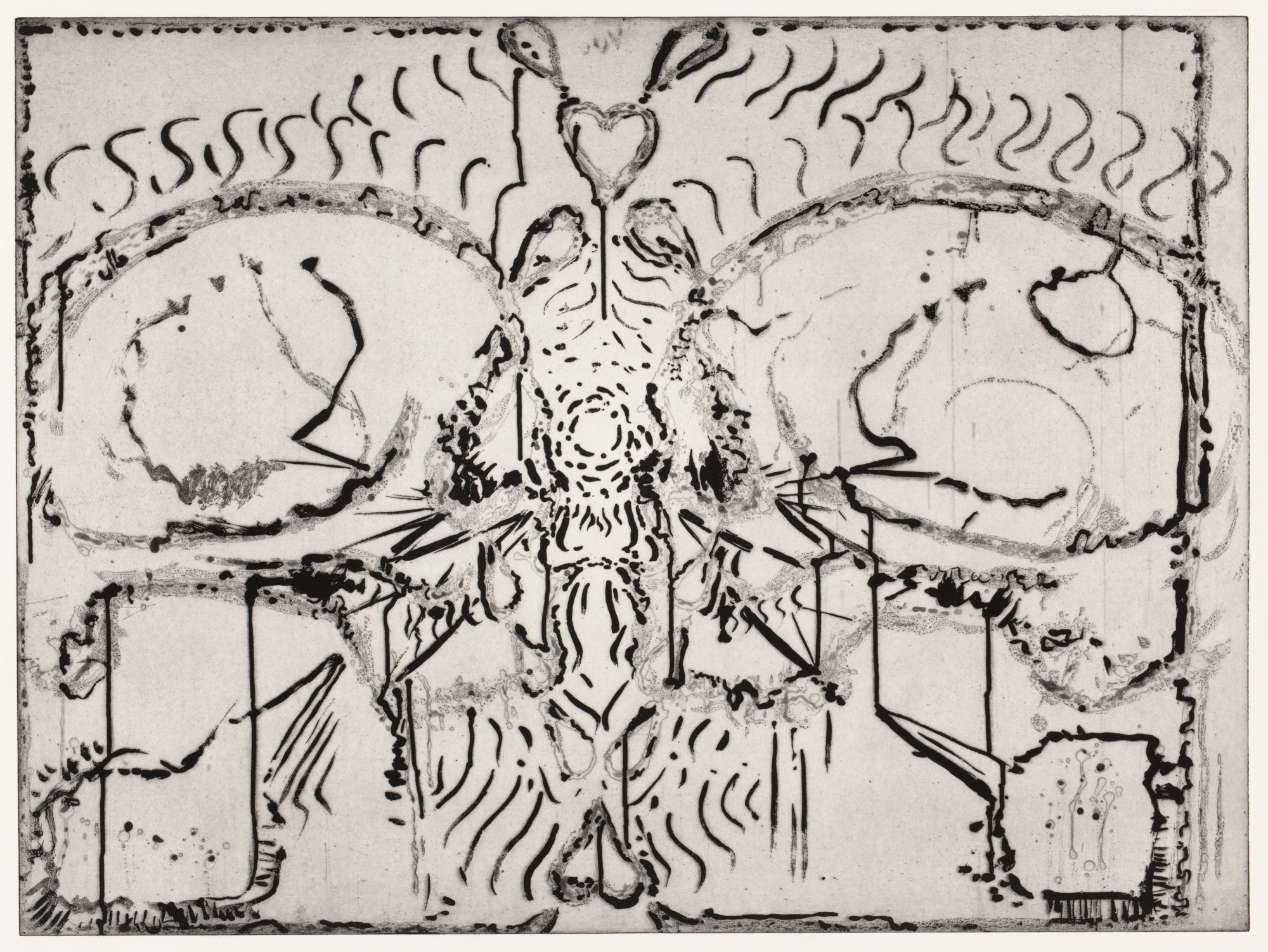
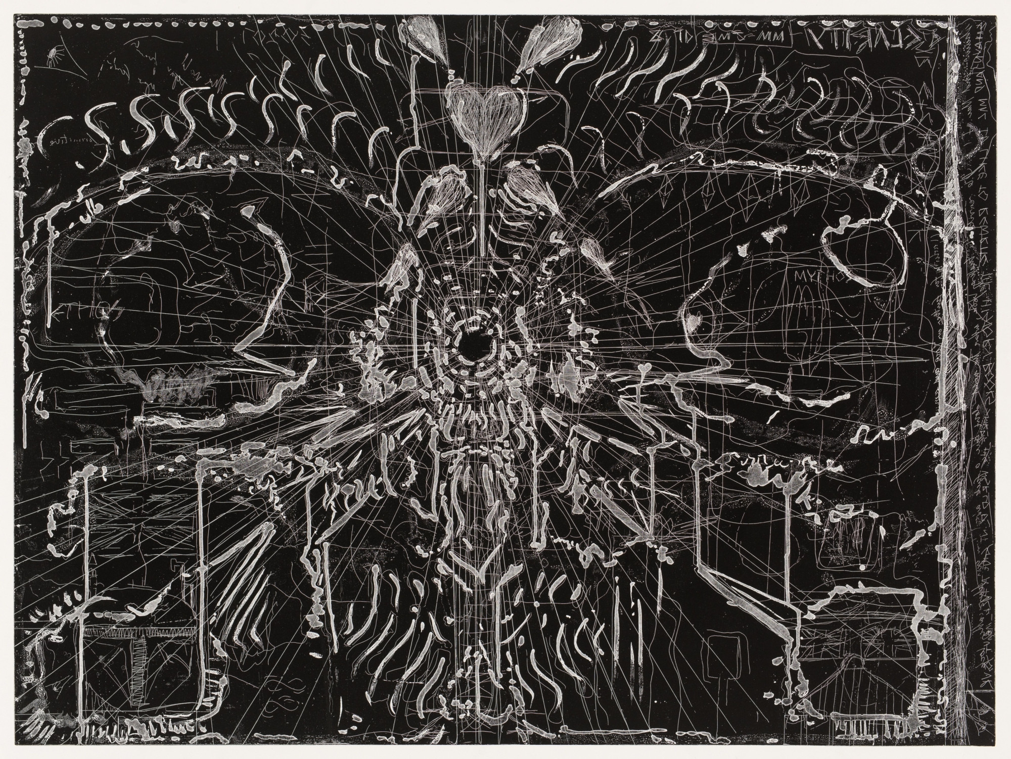
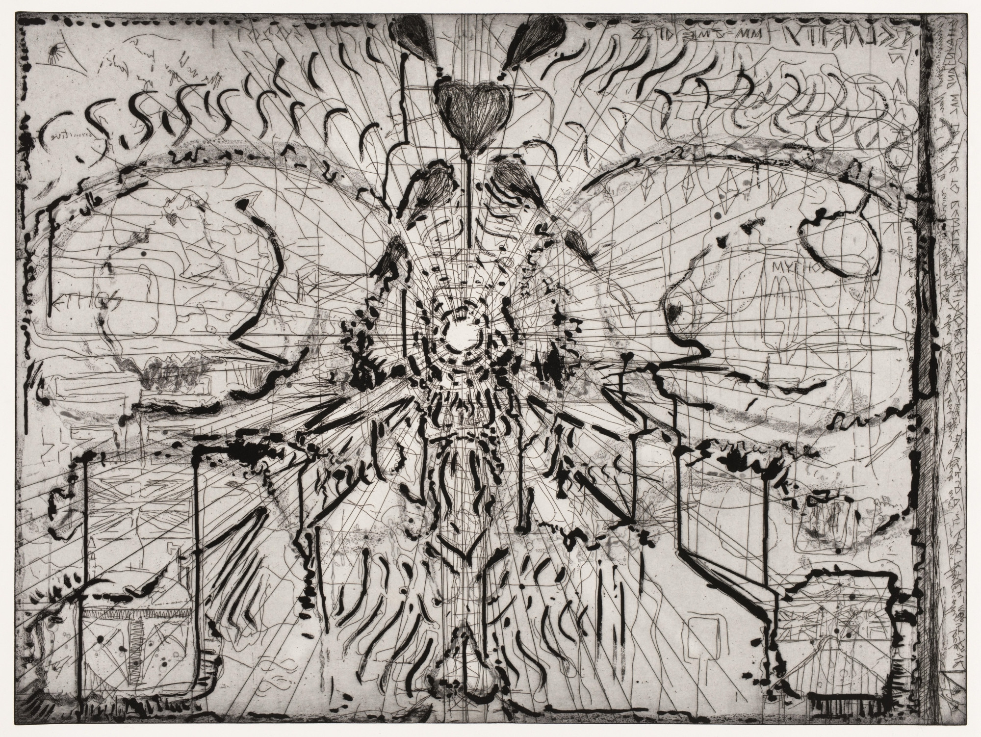
Can you describe how you used the 360-degree camera in the creation of Skulls “R” Us 1 – 3? Do you feel it’s important for the viewer to be aware of the technologies you used? I also just wanted to double check that you didn’t use VR to make these prints, but were working on VR projects at the same time?
I consider printmaking a form personal steganography that can erase, obscure, and conceal as much as define and describe. Transformations within images and across different states (n)either abbreviate (n)or elaborate upon forms and concepts. The process is paradoxical in revealing the veiling of images and vice versa.
Skulls “R” Us was arrived at through an interest in recording and reflecting on process as much as working towards a teleological end print or final state. The press in all forms and expansive iterations was approached in relation to ideas around transparency. Assange’s ‘Scientific Journalism’ could be applied to the printmaking process. It asks journalism to offer ALL sources in parity with research on physics which requires all experimental data to be published. Printmaking was already structurally capable of this transparency when offering former states, Bön a Tirer, and studies.
Preparatory works leading up to Skulls “R” Us depict two human skulls in profile. They mirror each other rather than see each other, due to the fact that they are just a visual description of forms (human skulls) that can no longer see (either as prints or represented skulls). Of interest was an image that would mirror itself like the mirroring with in the mechanical and photomechanical printing process. The highly reflective polished copper of the etching plate before being processed was already a reflecting mirror. The mimetic reflective function in printing was then associated with the temporal and spatial mimesis necessary for an understating (carnal logic) of extended reality.
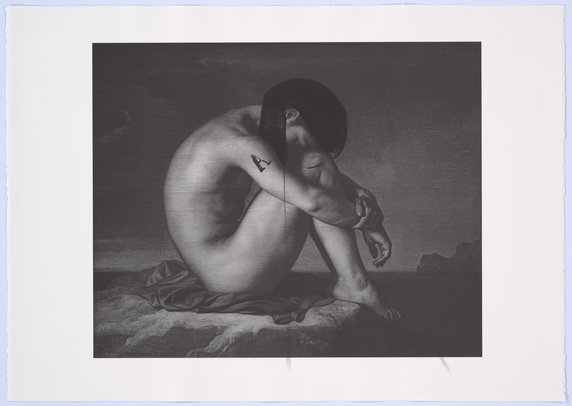
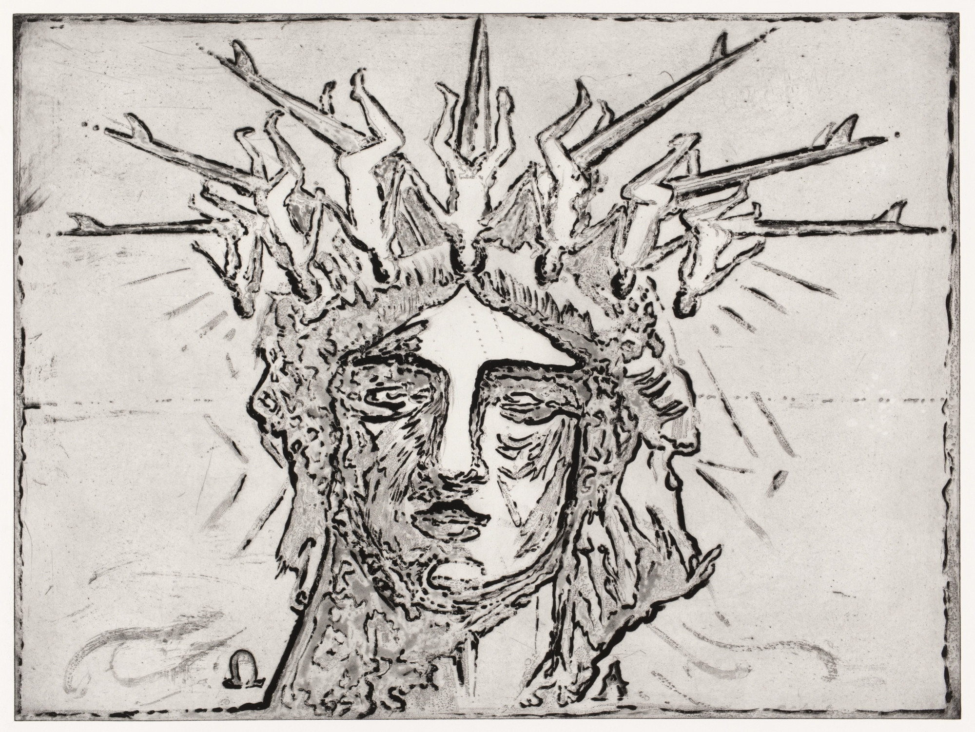
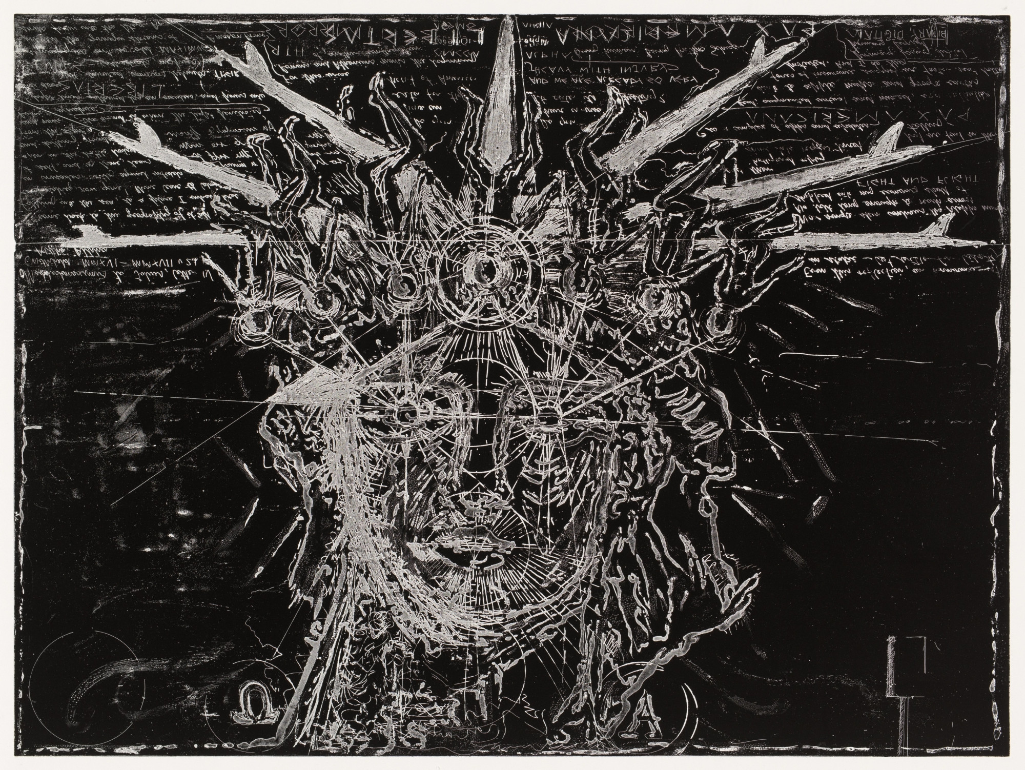
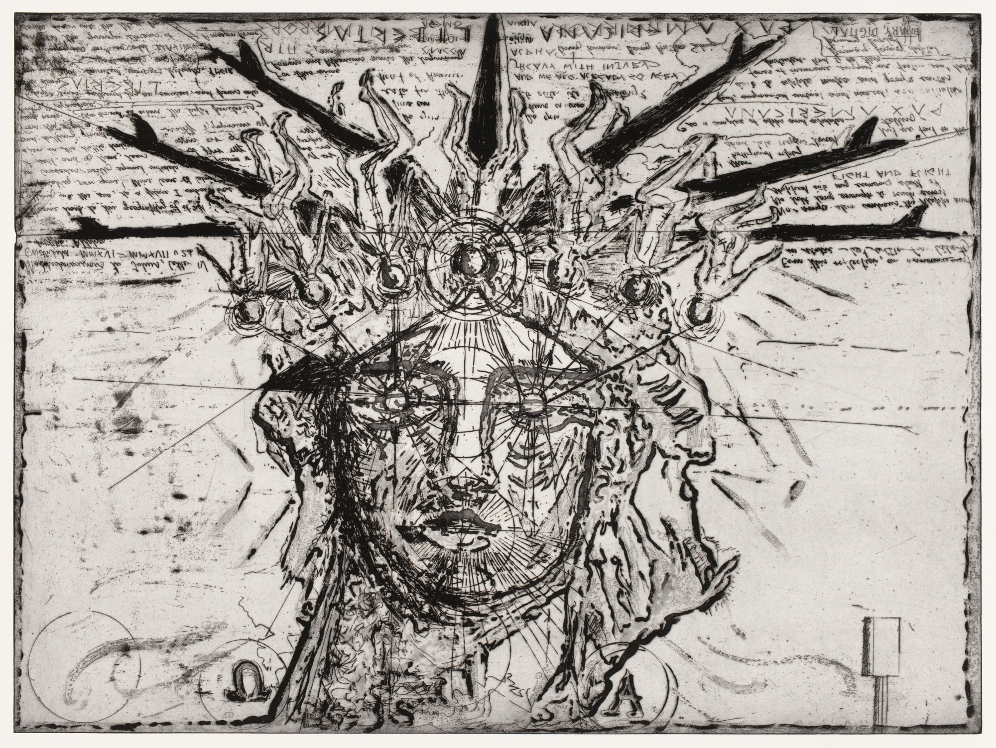
What inspired you to make the set of etchings Surfer Funeral for Liberty 1 – 3 centered on the statue of liberty? I read that you worked on a VR commission for The Watermill Center, New York, in the same year titled Libertas Vanitas, how do these works connect?
I’m very excited to be showing Libertas Vanitas soon. It will be included in a little XR space provisionally titled A Guide to Recent Metaversal Architecture. This title will soon surely be outdated, like the linotype having to give way to newer printing technology.
Surfer Funeral for Liberty and consequently Libertas Vanitas reflected my interest in iconography that was emblematic of entire philosophical, political, and social systems. Bartholdi and Eiffel’s Statue of Liberty (Liberty Enlightening the world)) is a neoclassical sculpture that produces this level of icon power. Its forms become a compression to a field so complex that this shorthand and simplification is also the icon’s failure. I wanted to rethink this highly recognisable form through the inverted imagery of a surfer’s funeral — also known as a paddle out ceremony. The surfboards were positioned to substitute Lady Liberty’s tiara rays, which itself is based on Themis, the Ancient Greek Titaness representing good council.
This etching was produced in the spirit of experimentation. The roll over process abstracted and transformed the figurative elements into the aesthetic of a robot from Fritz Lang’s 1927 film Metropolis or the latter C‑3PO droid from the Star Wars film series. Liberty regarding the actual effects of Imperialism appeared to be a political fiction in need of a funeral.
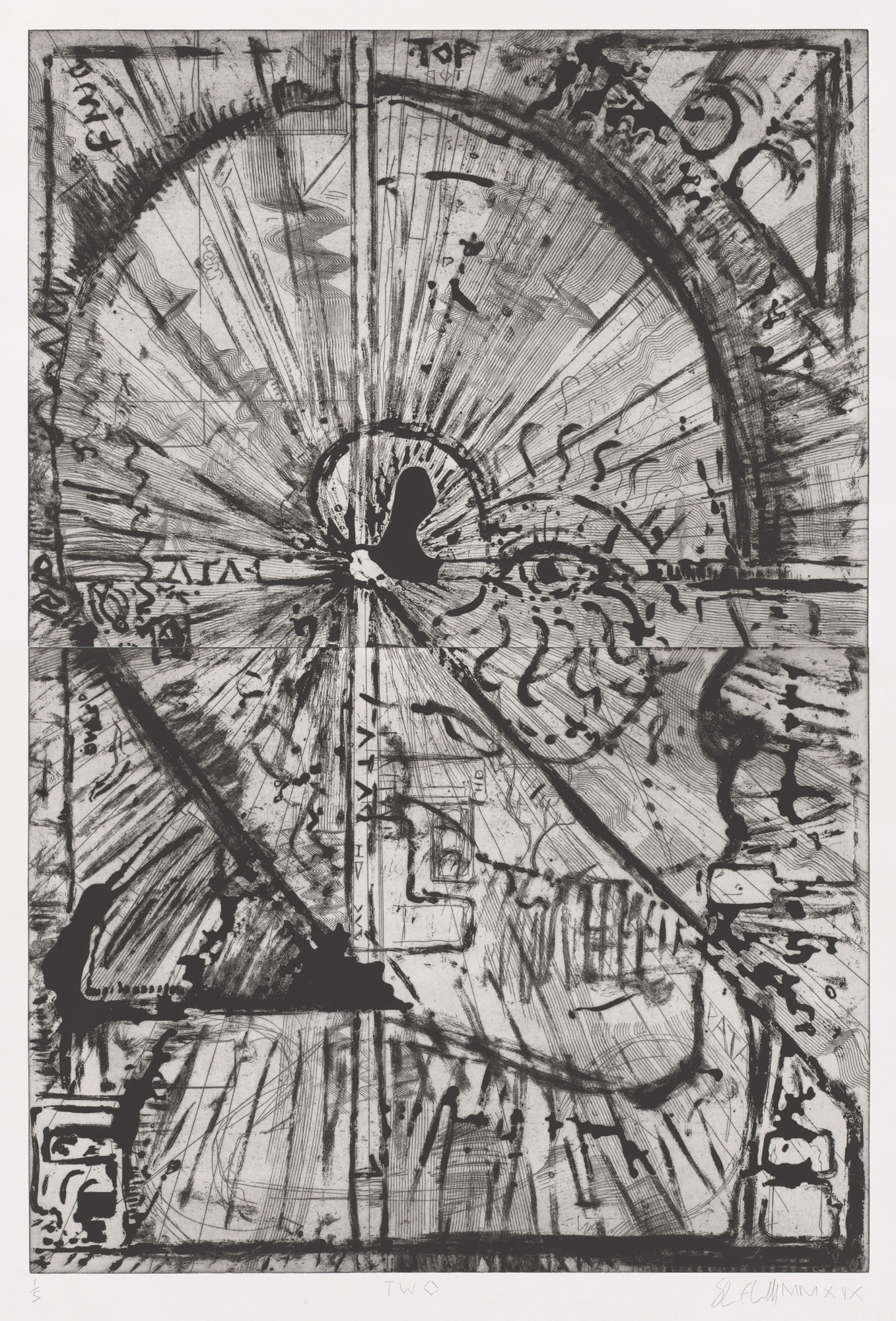
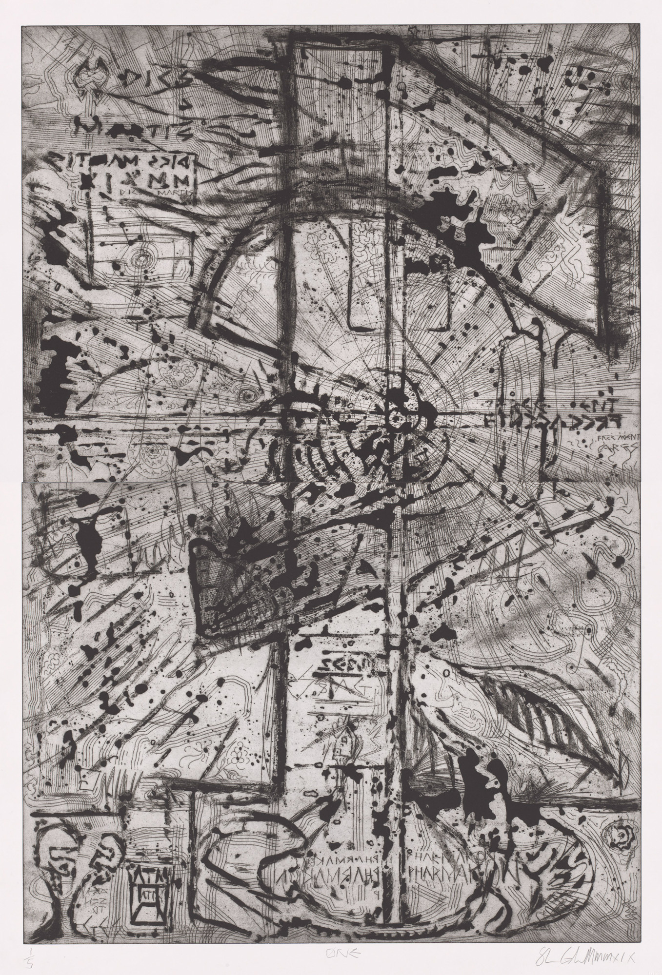
The lines in the etchings ØNE and TWØ remind me of staves in musical notation – there is a real sense of rhythm and movement in these prints, could you tell me a bit about the ideas behind them? In addition to art history, are there other sources of inspiration you draw on, like music?
In terms of the specific stylus, I think it was a wire comb — one of the many styli donated to the APW by artists that produced a stave-like-effect. To reciprocate, I think I left a set of dental tools (new and unused of course) in the tool box. I’m also an admirer of Jim Dine’s self-reflexive tool prints on this subject matter BTW.
Over the course of the entire output of prints there is a conversation both with the artists and technicians central to the printing process but there is an internal conversation or dialogue across the separate individual prints. I first set this idea into the lithographs with references to Fibonacci and competing Arabic numerals or digits against roman numeral forms — Fibonacci is the synthesiser here with his engagement of Arabic numerals/digits. Extending their potential to measure and model. This concept then transmigrated from the lithographs to a kind of visual compositional metonymy in these final etchings, which take the loose overall form of the individual digits ‘1’ and ‘2’. Concepts such as synaesthesia and aleatoric sound are of great interest to me, however this work was concerned with notation and numeration emerging/disappearing into/from their larger systems.
You compared the transformation of images through the various states of printing (as visible for example in Surfer Funeral for Liberty 1 – 3) to the multiple frames in moving image media. Could you elaborate on this, and how/if your experimentations with XR have influenced how you think about framing and organization of space in your printmaking?
Importing and translating images and ideas into Alberti’s window via printmaking allows the exporting of aesthetic and conceptual material to other media. Each image can be seen as part of a sequence where ideas, as much as the image, can transform. This sequencing is not necessarily linear or chronological.
In my recent prints, images are offered in a pairs or groups, and this is compatible with new digital media: images are not singular but multifarious and polysemous. Printing clearly translated into the saving and archiving of different beta versions of an XR environment or layers in photoshop. Both printmaking and XR offer an initial thesis, only to then be questioned via antithesis and finally organised into a synthesis — often, all in the same folio or codex.
You mentioned that you are interested in conveying “printmaking as an environment and unfolding conversation” – could you talk about this in relationship to your experiences collaborating with the printers at APW?
The panoptical 360 camera framed not only the plate but the entire space in which the print was produced, and this was significant when reviewing and analysing material. The perspective was from the plate as a surface and field. I once thought these spherical and inclusive optics presented the dissolution of the Albertian frame, but this was possibly a case explained by Amara’s law, which suggests we tend to overestimate the short-term impacts of technology and underestimate the long-term effects. I now realise XR is just another type of framing device.
– Shaun Gladwell interviewed by Katharina Prugger, Curator, National Gallery of Victoria, 10th September 2021